Simpson’s paradox is not actually a paradox, but it is an interesting result in statistical analysis with an important lesson for data scientists. The level of aggregation of your data and analysis can entirely change the results. Simpson’s paradox is the idea that a relationship that holds at one level of aggregation may not exist or may even go in the opposite direction at other levels of aggregation.
To demonstrate with a concrete example, let’s look at some Palmer Penguins data and the relationship between bill length and bill depth.
Import libraries and load data
import numpy as npimport pandas as pdimport altair as altfrom palmerpenguins import load_penguinsdf = load_penguins()df.head()
species
island
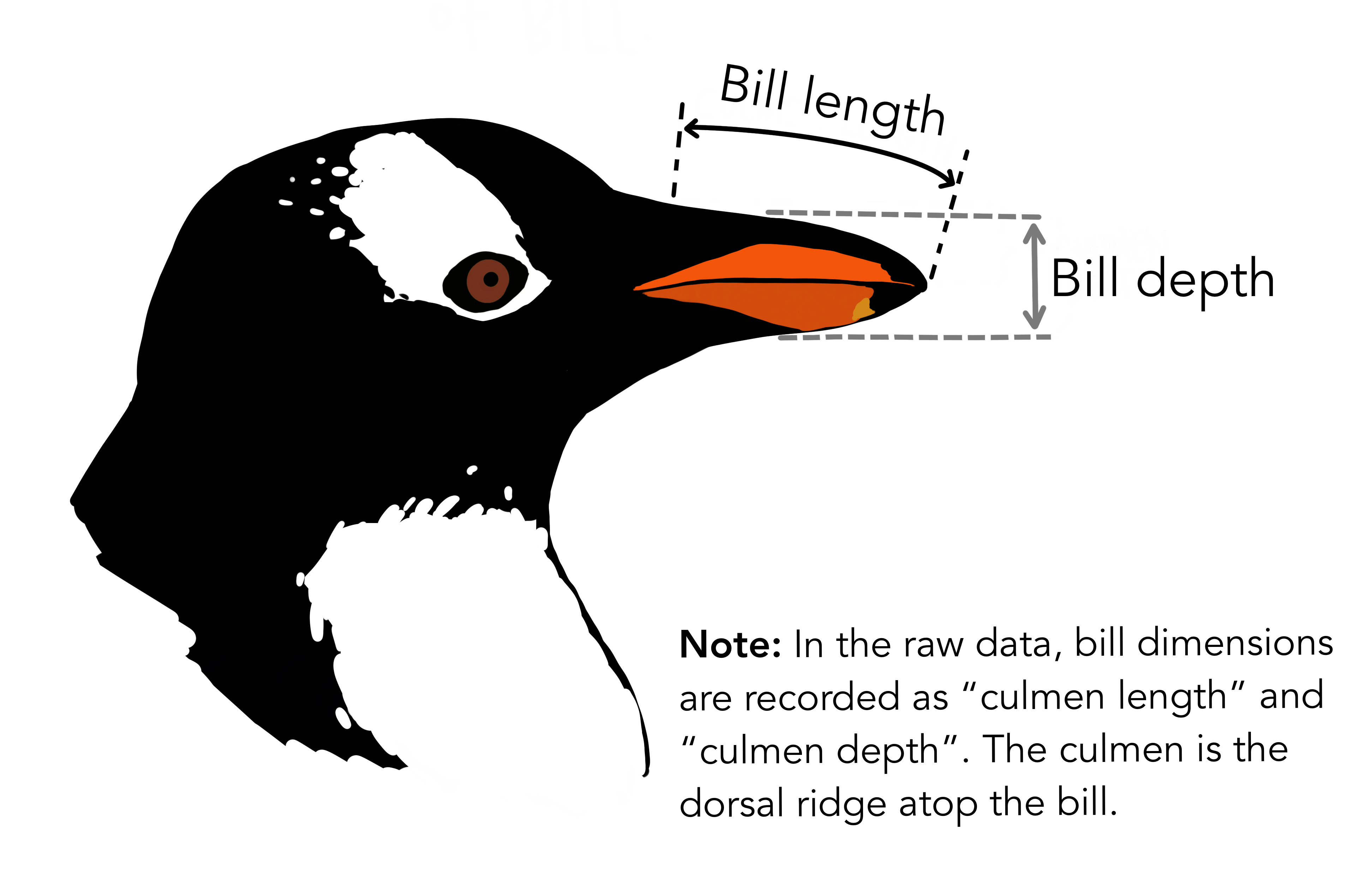
bill_length_mm
bill_depth_mm
flipper_length_mm
body_mass_g
sex
year
0
Adelie
Torgersen
39.1
18.7
181.0
3750.0
male
2007
1
Adelie
Torgersen
39.5
17.4
186.0
3800.0
female
2007
2
Adelie
Torgersen
40.3
18.0
195.0
3250.0
female
2007
3
Adelie
Torgersen
NaN
NaN
NaN
NaN
NaN
2007
4
Adelie
Torgersen
36.7
19.3
193.0
3450.0
female
2007
Plot the data
#ungrouped graphsp_ungrouped = alt.Chart(df, title ="Bill Depth and Bill Length in Penguins").mark_circle().encode( alt.X('bill_depth_mm', title ="Bill Depth", scale = alt.Scale(zero =False)), alt.Y('bill_length_mm', title ="Bill Length", scale = alt.Scale(zero =False)))#x value first, then y plt_ungrouped = sp_ungrouped + sp_ungrouped.transform_regression('bill_depth_mm', 'bill_length_mm').mark_line()#grouped graphsp_grouped = alt.Chart(df, title ="Bill Depth and Bill Length by Species of Penguin").mark_circle().encode( alt.X('bill_depth_mm', title ="Bill Depth", scale = alt.Scale(zero =False)), alt.Y('bill_length_mm', title ="Bill Length", scale = alt.Scale(zero =False)), color ='species')#x value first, then y plt_grouped = sp_grouped + sp_grouped.transform_regression('bill_depth_mm', 'bill_length_mm', groupby = ['species']).mark_line()plt_ungrouped
Misleading analysis from high level data
plt_ungrouped
When we look at bill length and bill depth in an initial scatterplot it seems as though penguins with deeper bills tend to also have shorter bills. While this is technically true in our selection of penguins, it’s also very misleading because we haven’t done anything to account for the different species of penguins that make up our sample.
The effect reverses when accounting for penguin species
plt_grouped
The underlying scatterplots here are the identical, but we see very different relationships between bill depth and length. Within each penguin species, penguins that have bigger bills tend to have bigger bills in terms of both length and depth. But Adelie penguins tend to have deep and short bills compared to Gentoo penguins, which are longer and narrower. Even though we have individual penguin data, we’d still be mislead if we didn’t account for the groups. This is also a place where traditional statistical techniques can help us if we’re building a model that includes species in the data. A major problem here is that you don’t always know which variables might be missing for your dataset, and so it’s important to approach with a research-informed mental model of what your analysis should look like to help avoid drawing poor conclusions from incomplete information.